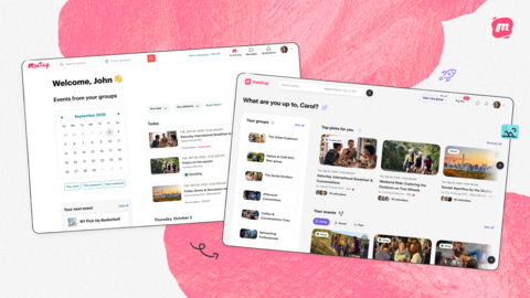
Meetup, the digital platform known for fostering real-world connections for over 20 years, has launched its most significant redesign to date. The updated look, now live on Web with Mobile coming soon, blends a refreshed visual identity with a more intuitive user experience.
The redesign introduces a new logo, brighter color palette, modern fonts, and expressive icons, alongside high-quality photography highlighting people connecting in real-life scenarios. The interface has been refined for readability, with improved spacing, stronger contrast, and simplified navigation to make event discovery faster and more engaging.
“We wanted to make Meetup feel even more inviting and intuitive, while celebrating the visual elements that can play a huge part in conveying the energy of a community,” said Alex Landra, Meetup product designer.
This design overhaul builds on previous updates, such as a mobile event discovery layout that boosted RSVPs by 20%. It reflects Meetup’s growing popularity with younger users, particularly Gen Z and Millennials, who now make up 40% of its global active user base.
According to Chiara Vivaldi, product lead at Meetup, the new design aims to resonate with younger audiences while staying true to the platform’s original mission: “We wanted the new look to resonate with our younger audience while honoring the spirit of Meetup and the community who’ve made it thrive.”
Since being acquired by Bending Spoons in 2024, Meetup has rolled out multiple improvements, including Meetup Starter, its first free organizer plan, and AI-powered recommendations for personalized event discovery. These changes have fueled a 20% year-over-year growth in new registrations, further solidifying Meetup’s role as a go-to platform for meaningful, face-to-face engagement.

